Ace Trace Social Feed and 2022 Updates
2022 summary

- A lot of things have happened in the last year:
- I’ve hired several ML engineers to help me with the object-tracking algorithm.
- I’ve hired two interns. One for computer graphics research and another - for an alternative tracking algorithm research
- I learned a lot at the YC Startup School.
- I met a dozen local indie founders from Boston.
- I met a hundred other founders at the YC cofounder-matching platform.
- I’ve joined several startups as a potential co-founder. Spoiler alert - none of these projects worked out.
- I’ve studied ML for computer vision, researched recent papers in the field, and developed a unique and efficient algorithm for the golf ball tracking.
- I finally fixed media codec errors on the Android platform and re-created the whole rendering engine for the Ace Trace app.
Tools
I continue to constantly use and learn about different tools, for example, Docker, AWS EC2, S3, and PyTorch. I use Firebase in every startup I join - I cannot get enough of it. It’s my number one tool. Mixpanel proved to be the best analytics dashboard - I constantly develop and monitor metrics, run A/B tests, and integrate Mixpanel in every project. Even the UX/UI of Mixpanel is outstanding - it feels good to even just refresh the dashboard sometimes.
Ace Trace - the social feed
In November, I met Eugeniy Lisovskiy - co-founder of Level Up Basket. He is definitely a very interesting guy - former CMO of Litres and CEO of Maps.me. Man didn’t he tell me a lot of stories about the Russian startup scene! We talked a lot about his project - it’s a mobile app for basketball. In fact, they try to make it the only app for everything basketball related which is in my opinion is a very ambitious goal.
They have a lot of interesting ideas in their mobile app about retention, and I decided to try some of them out. The most obvious thing was to try to create a social feed in Ace Trace. This way users get social approval and get addicted to the app - as Instagram and TikTok users do. It took me a couple of months to develop my own “Instagram” for Ace Trace videos.
Gamification
The idea was to allow users to post videos within the platform for free and engage them with gamification.
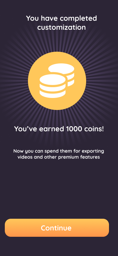 For example, users earn coins for every post they make and for every comment they leave for someone else’s posts.
They can spend such coins to download videos from the platform, which is usually only possible with a paid subscription.
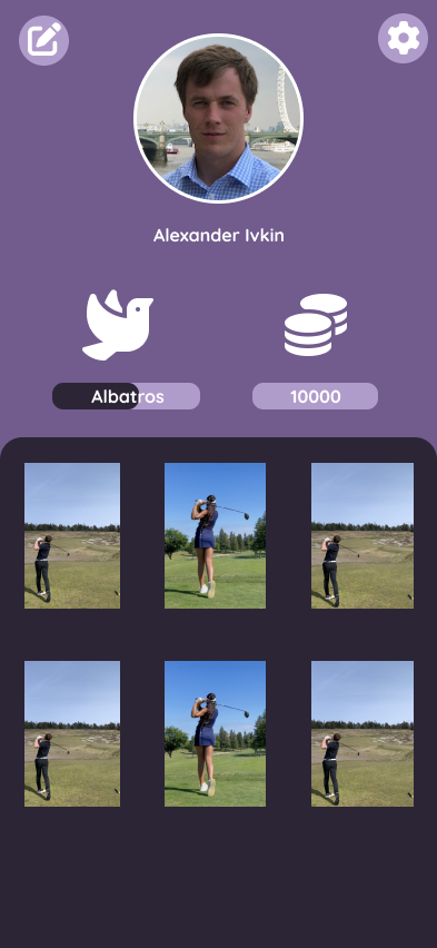
Also, the more traces you create, the more advanced your character becomes.
Your character is a bird that grows from a goldfinch to an albatross - the most valuable bird in the golf game.
I’ve hired my friends - graphic designers from Saint Petersburg, to create the bird characters.
For this project, I found several QA engineers that wanted to learn how to test software and organized weekly meetings with them. During that time, I was releasing updates and fixing issues they found in it.
Integrating Flutter
The whole social part of the Ace Trace was written in Flutter - to allow easy support on iOS and Android later as opposed to having two completely independent native apps for each platform.
It was a fun opportunity for me to learn this new technology.
I really had a hard time integrating Flutter into an existing native iOS application.
Sometimes I had to show the user an old native screen and handle all the navigation between the native and Flutter screens.
This is not something many people have done before, and there was not much documentation on how to implement this.
I created a method channel and sent messages back and forward between the native and hybrid parts of the app.
More info about the platform channels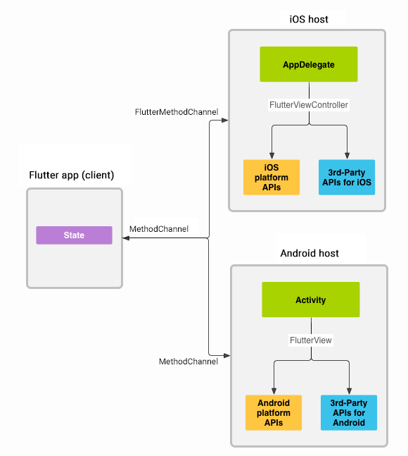 A lot of corner cases caused bugs, of course - thanks to the QA team, we managed to find most of them before rolling the app out to production.
Firebase
For the app’s social features, I’ve created a separate backend running on Firebase Cloud Functions and the Firestore. BTW, Cloud Functions are really cool - the fastest and easiest way to create a backend for your app. I’ve covered this backend with unit tests - it saved me many days debugging and fixing bugs later.
The complicated part was to combine Firebase usage on the native side of the app with the Flutter side.
There is no way to pass an authentication token from one instance of Firebase to another (Google - you can do better than this!), so my original solution with two independent Firebase instances didn’t work.
The only way of doing it right was to move all the Firebase code to either the native or the hybrid side, which was way too much work.
So, in the end, I came up with a hack to allow users to authenticate on the Flutter side and use all the API from the native side with no authorization checks.
It was a security hole for sure; however, in my case, for a short-time experiment, the risk was worth it.
 It would not be reasonable to spend extra weeks of development to make it secure, and now that I know I had to roll the whole experiment back, it’s enjoyable that I didn’t do it.
Hosting and playing videos
That was the main hardcore part of the project - to allow users to upload videos to the cloud and play them back in the app. It also important that videos load quickly and play smoothly. In the same time the challenge was to not download extra data and not to spend extra money on the cloud storage and traffic. As an experiment I’ve decided to truncate the videos to only contain the trace part - this was I could save on the storage. For the traffic I decided to compromise and not preload too much, which resulted in not ideal user experience, however it was good enough for the experiment.
Push notifications
That was the essential part of the experiment - to notify users about new comments and likes on their posts. Otherwise, the whole social feed would not make sense - I only expect the retention to increase when users are brought back to the app. I’ve designed and implemented my own solution for sending push notifications to the users. I even added aggregation of the notifications to avoid spamming the users; however, that part was obviously not necessary for the experiment.
Illustrations
I had to create some new graphics, and this time I didn’t have a designer working with me, unlike at the beginning of the Ace Trace project.
However, it felt terrific to use my art skills and create something on my own.
So I rolled up my sleeves and opened Figma.
I’ve managed pretty quickly to draw a few illustrations using primitives like rectangles, circles, and bezier paths.
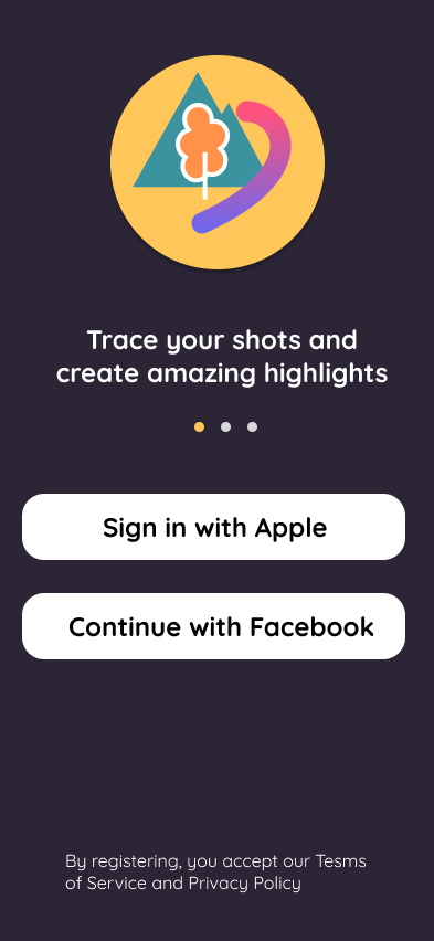 Figma is an insanely great tool that enabled my inner artist.
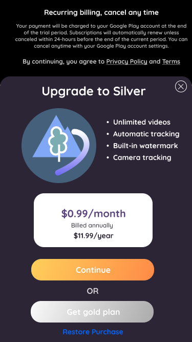
I added some simple images for my signup screen. Now I repurposed these ideas for my paywall screen in the app.
Results
As usual, I ran an A/B test to measure if there was any difference in user retention - that was my number one goal - to increase retention. Unfortunately, the test didn’t show any significant improvement in retention; however, it did show degradation in conversion. So eventually, I had to terminate the experiment and roll everything back to how it was before that. I’m glad I didn’t waste too much time on this experiment, and was able to learn a lot from it.
After all I think this was an artificial way to keep users engaged which felt wrong to me since the beginning. What I believe in and what I’ve been taught in multiple startup lessons is to solve the users’ problem and find the product-market fit. Retention should follow if you do it right.
However, this wasn’t the only experiment I’ve run in the last year. Stay tuned for more updates on my other projects.